2022
How we enabled the 'Group Class' users to visualise their workout performance and improvements while also helping them celebrate and share their milestones.
VISUAL DESIGN | B2C | MOBILE APP

My role
Visual Designer - Conceptualisation,
Visual Design, Prototyping and
Developer Handoff.
Team
Solo Designer with the
Design Lead as Project
Manager and 2 Engineers
Timeline
4 Weeks
Overview
Founded in 2016, cult.fit is a fitness company offering a holistic wellness experience by making fitness accessible and enjoyable for everyone through group classes, gyms, and sports, providing users with flexibility and choice.
This project focuses on enhancing the post-workout experience for 'Group Classes' in the cult.fit app. We enabled users to visualise their progress and highlights of their class within the app to boost engagement, encourage users to keep coming back and book their next class.
It all started when the Head of Design reached out to me during my internship to revamp the experience of group classes.
CONTEXT
The Background
That quarter, cure.fit's goal was to enhance the product and customer experience. Among the various offerings, ‘Group classes’ have been the flagship product in cult.fit. However, after completing a session, there was no engaging way for the users to interact with the cult.fit app or track their progress. This called for a revamp to increase engagement while also encouraging class re-booking through the app.
Being an intern I was given a lot of smaller projects to work alongside a full-time designer, but the Head of Design entrusted me to work as a solo designer and collaborate with the engineers. I took this opportunity to learn, understand the process and see my first project go live.
What are group classes?
Group Classes in cult.fit are trainer-led sessions where people come together to work out. These classes offer a range of formats with varying intensities, including Dance Fitness, Boxing, HIIT, and more. Held at different time slots every day, they can be conveniently booked through the cult.fit app.


PROBLEM STATEMENT:
After completing group classes, users had no engaging experience on the cult.fit app, resulting in low app usage. How might we enable users to visualise their workout performance and celebrate milestones immediately after their group classes?
OLD EXPERIENCE:
The class ends, we ask for feedback, and… that’s it! ⚠️
After a cult member completes their group class, he is welcomed with a class completion banner with only a CTA to book the next class and a bottom sheet asking for feedback!
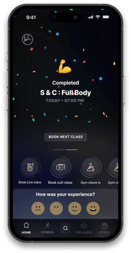
Homepage after class completion

Feedback page (from bottom sheet)
The problem 1:
After class, there was little to acknowledge the user's efforts; we only asked for feedback or to book the next class, making the experience feel transactional.
A group picture was taken after every class, but they were kind of hard to find! ⚠️
After every group class, the trainer would click a picture of the members and upload it within the cult.fit app. This picture would then be accessible to the users.
However, these pictures are tucked away in the 'Profile section' under ‘Activity and record’ and then ‘Memories.

The problem 2
The group class photos, which could foster a sense of community and recognition, were buried under multiple clicks, making them difficult for users to find or share.
APPROACH
We identified the key goals that the users must achieve. ✅
Based on our findings, we wanted to create an experience that allowed group class users to:
📈
Gain insights from the workout
👥
Establish a sense of community
🏆
Share their achievement
Some principles to keep in mind 💭
To ensure an optimised and comprehensive experience in solving the problem, we decided to follow these principles:
One fold experience
Consolidate all information in one place.
Fresh & dynamic
Keep information relevant and updated.
Consumption-only Screen
Provide quick information with minimal CTAs.
Highly Personalised & Actionable
Tailored insights based on user data.
THE DESIGN
We decided to create a highlights page that shows up after every group class. ✨
A highlight page was introduced which would show up in the cult.fit app right after the user completes the group classes.
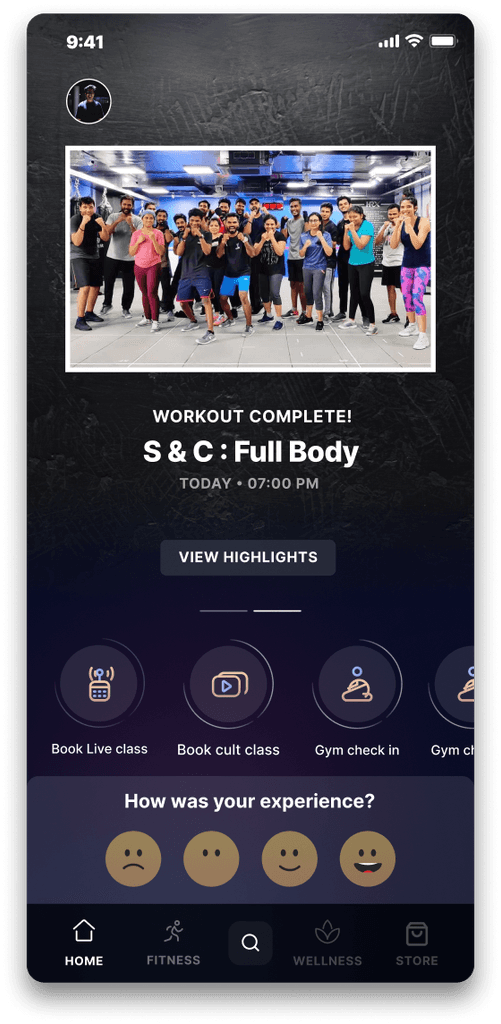
Homepage banner and the entry points:
Entry point 1:
The CTA 'Book Next Class' was swapped for 'View Highlights,' inviting users to explore the highlight page and making it less transactional.
Entry point 2:
The feedback page is now directly integrated into the new highlight page, turning the bottom sheet into another entry point.
Dynamic Hero Banner
Different use cases of the Hero-Banner:
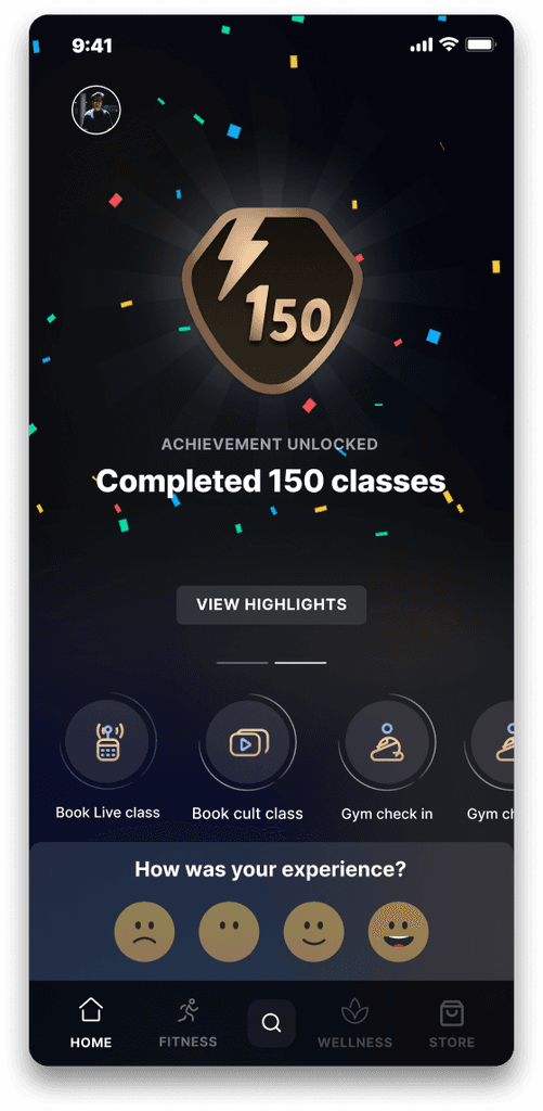
User reaches a new milestone

When trainer clicks a group picture

No picture or milestone
The highlight page:

Sharable Insight Card ✨
The highlight page introduces the Sharable Insight Card, letting users discover cool and valuable insights about their group-workout sessions and share their achievements in a personalised way!
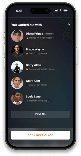
Building a team! 🤜🤛
Allowing users to see and add other members from their group class, creating connections that last after the workout!
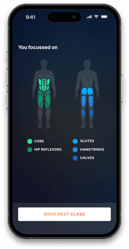
Visual Evidence 💪
A body heat map displays the targeted muscle groups, offering valuable feedback while also helping users decide which muscles to focus on next and what class to take!
Floating CTA asking to book the next class 🙌
The Shareable Card:
The Shareable Insight Card is all about being fun and dynamic! We dove into different touch-points and use cases to make sure it feels personalised.

With only achievement badge
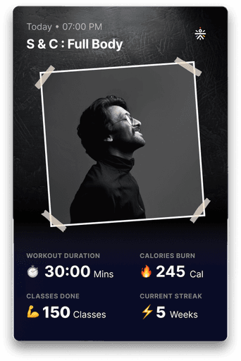
With uploaded picture
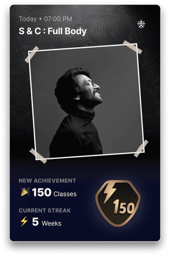
With Badge and uploaded picture
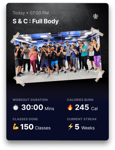
With group picture
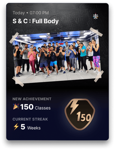
With badge and group picture
THE RESULT
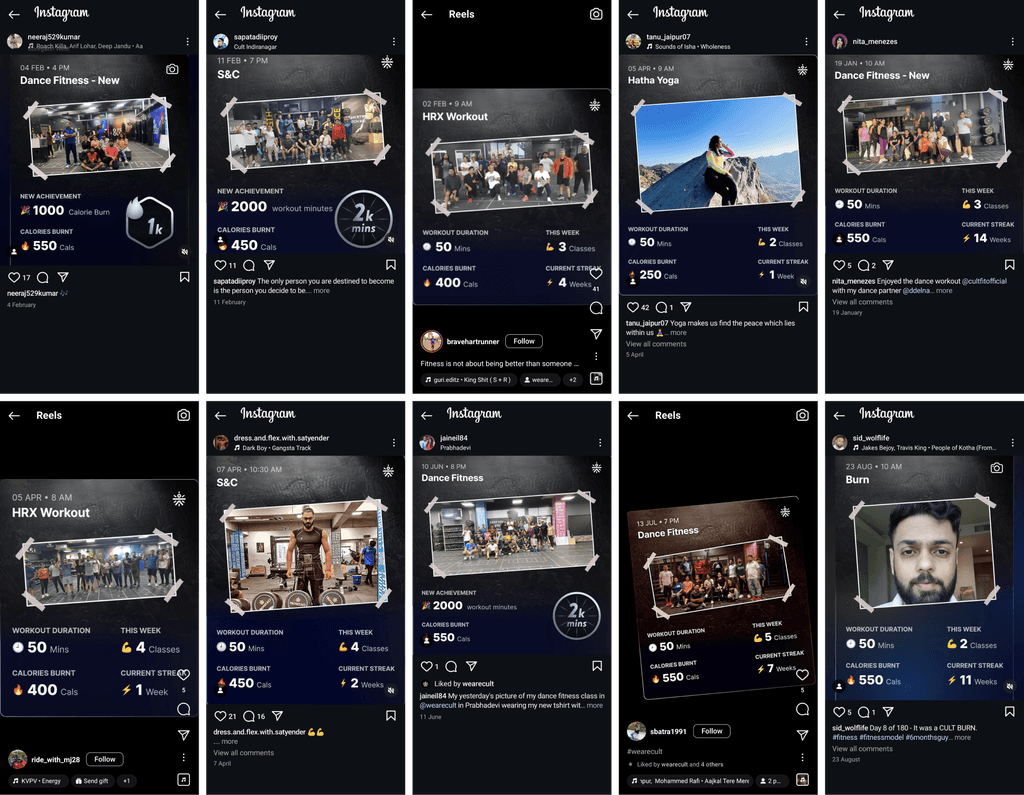
We could see it working! 💪
We started seeing our shareable card on social media. What more could be special than seeing your design working the way you wanted to!
It was a special moment for me and the Head of Design!
WAY FORWARD
After the project wrapped up, I landed a full-time role and jumped into new projects for cult.fit's CRM Tool - the 'Partner Portal' with the growth team.
But, multiple new features are still being added to the highlight page!
Squad feature was integrated
A squad feature was added, letting users quickly add people they worked out with to their squad directly from the highlights page!
Karma points was introduced
Users can express their gratitude to fellow class members and earn karma points right from the highlight page!
*Data as of Aug, 2024
Check out a glimpse of the latest update here↗.
RETROSPECTIVE
As an internship project, I learnt a lot!
This was my first live project. It offered valuable insights into the role of a product designer—from collaborating with developers and aligning with product managers to making crucial design decisions and shipping the project.
2 key learnings from the project:
🤝
Alignment with the Dev is crucial
Effective handoff and communication with engineers are essential; not everything will turn out exactly as envisioned!
👀
Project going live is not enough
It’s important to gather metrics post-launch to assess impact. There’s more to success than just seeing your design live!